


- GET EXCLUSIVE GOODIES

IN YOUR INBOX
Filed In: Inspired
Dreaming of Her Living Room
1 / 2 / 3 / 4 / 5 / 6 / 7 / 8 / 9 / 10 / 11 / 12 / 13 / 14 / 15 / 16 / 17
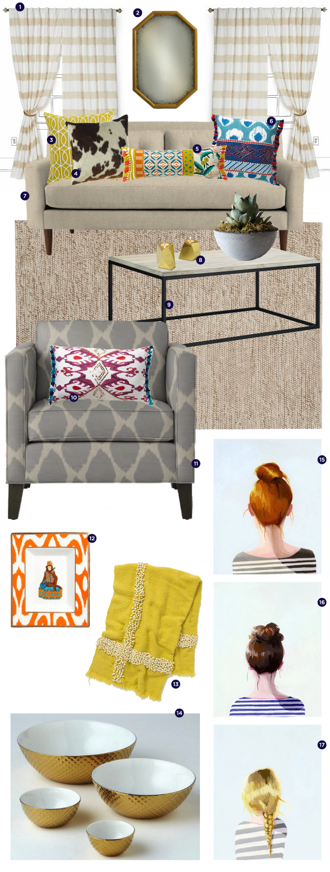
My sister Katherine is due to graduate from Auburn next December and is hoping to get a job and move to Atlanta, GA shortly after. She’s in finance and has already informed me that I will be ‘hired’ to help her decorate, a job that I was super excited to take on! While we were in Europe, we found a few small prints that will be perfect in her apartment and got both of us back on the subject of decorating.
A few days ago she sent me a picture of this chair and then I sorta went overboard and designed a whole room for her. I have a feeling there will be many more versions of this in the near future until we get it just right! I’m loving this room for the bright colors, mixture of textures and patterns and unexpected pops of gold.
What do you think? Would you hang out in her living room?



Two Directions

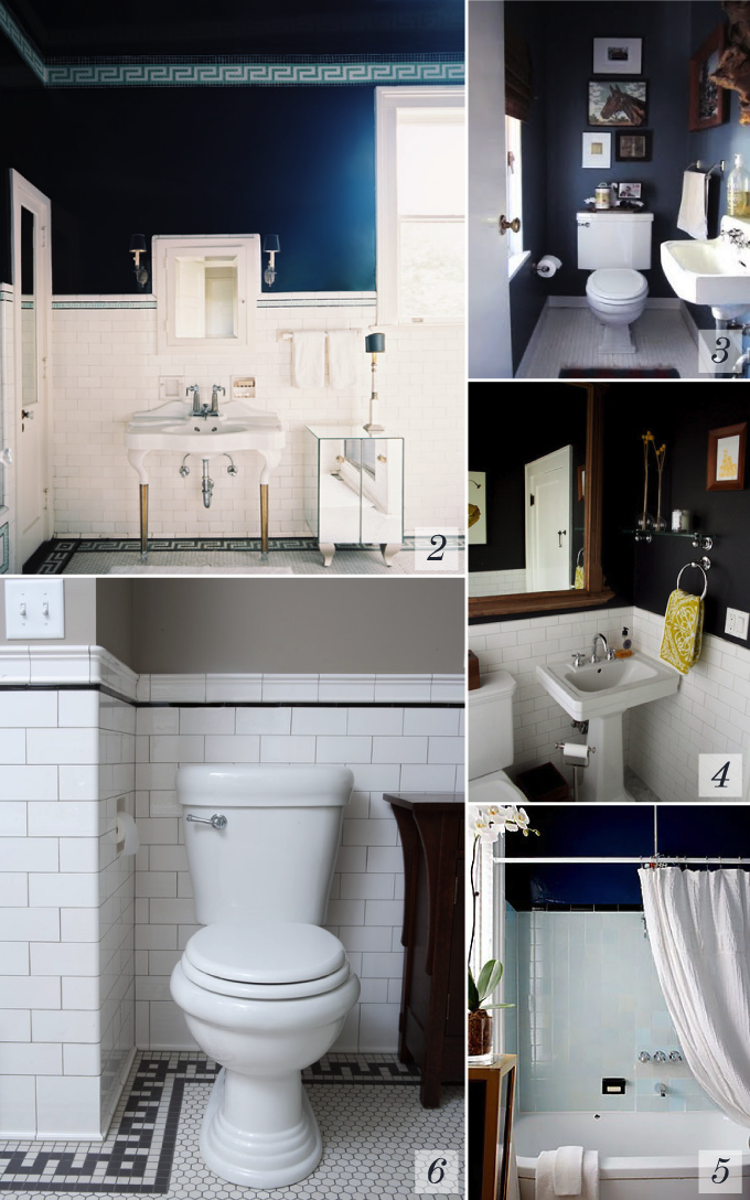
I hate red as a wall color. I don’t know how you feel about this bold hue on walls, but I despise it. On clothes, small accents, it’s great, but geez Louise, just don’t put it on my walls.
When we moved in to this apartment, several of the rooms were painted red. You can imagine my disappointment. The apartment had great bones, but some nasty nasty wall colors. The one bedroom got painted over immediately and after the living room, guest bath, dining room and a second bathroom got painted, I was just sick of painting even though the last bathroom was still red. I figured I’d deal with it later.
And later is sure right. I’ve been living here over a year now and it’s still red. Ew. But this weekend that’s all about to change. With a new roommate moving in just a few weeks, it lit the project fire yet again. I picked up several paint colors this week and I think we’re leaning towards a deep navy. The majority of the bathroom is white tile, so I think this will be just beautiful.
Oh and then there’s the topic of towels… I’m loving these and these.
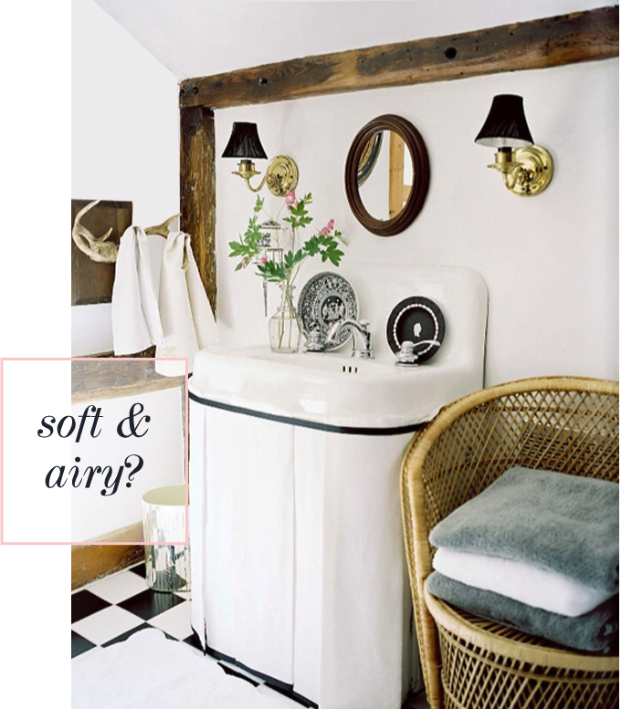
Of course, going light and airy was my second thought, but for now, I think I’m going to go dark and bold. Which color palette would you go with? They’re both beautiful, aren’t they?
Styled Mantels

1 / 2 / 3 / 4 / 5 / 6 / 7 / 8 / 9
Mantel pieces have been on mind lately. My roommate moved out recently and with her went the huge painting that sat above our faux fireplace and now it just looks empty, blank and sad.
It’s crazy how much bigger it looks when there’s nothing on it either. So many times we’re trying to create space in a room when we decorate, but for my living room, I’m always trying to make it feel smaller, cozier and more quaint. It’s far too big for two people — rental problems.
Since I’m working on a large painting for one side of the living room, I don’t want to have another huge painting over the fireplace. Instead, I’m hoping to create something similar to the pictures above, a bit of a collection of sorts. I love the combination of mirrors, photographs, paintings, flowers, sculptures, etc. It gives the mantelpiece quite a personality, don’t you think? I also like that you could change things up easily by adding a new item or switching out an photograph for a new one.
The only real issue I see with my mantel is that the wall behind it (faux chimney) is slanted. Really a terrible design feature in my opinion, but again — rental problems — I’ll make something work!







 The Fox & She is a style and lifestyle blog written and curated by Blair Culwell.


