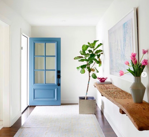
photo via Layne Torsch interiors
Last week I got this random surge to redecorate and rearrange just about every area in our house and I think I know what sparked it. When we moved into this place just a little over a year ago, it happened really unexpectedly. We were fully planning on staying in our previous apartment for another year and just before our new lease was to start, the landlord announced he was selling the unit. That left us three weeks to find a new home, book movers and pack everything up.
The first few places we looked at were all smaller than our last place (which was around 850 sq ft) and a lot more expensive. It was really discouraging, but then we fell upon something good. Well, at least we thought so. There weren’t any pictures on the listing, just the name of the building, the unit number and the floor.
We immediately started stalking the buildings Zillow listings and we came across the same number unit as the on online, just a few stories higher and it was gorgeous. Oh, and it was a corner — say what?!
When we came to tour the unit I was expecting something to be horribly wrong with the place — how had a well-priced corner unit been on the market for 4 months?! — but it wasn’t. So we signed the papers that day and moved two weeks later.
Since it all happened so fast, I never had time to decide if our current furniture was a good fit for our new place and for all of last year, all the random pieces that we’d jammed in here, just sat here collecting junk, until finally I couldn’t take it anymore.
Over the past few months, I’ve been systematically cleaning out different areas of the house — first the kitchen, then clearing out the old kitchen island (then selling the island!), then the TV console, and lastly our closet, which could use another clean out soon. Purging all that junk has been liberating and our place is finally starting to come together. In fact, I’m finally going to be doing a house tour in the next few weeks, but more on that later!
One area that I really want to freshened up is our entryway. The hard part is that it’s dark and tiny, so I’ve struggled a lot with what to do with the space.
Right now we have one of my big paintings and a skinny console table. The table wobbles, mostly due to a loose floorboard (how do you fix that?!) and isn’t very sturdy and I’ve outgrown the painting.
Today I pulled a ton of inspiration so I can get the wheels turning and it’s working! I’m still not decided on anything, but the first thing to tackle will be the lighting issue. I think one of the biggest reasons that I don’t like that area is because it’s dark — not the most welcoming thing to come home to, you know?
There’s a spot to hang a light in the entryway and I’m still confused why they didn’t just put a light there in the first place, but it’s an easy fix! Right now I’m loving this fun fixture but I can’t decide if I like the gold or black better.
Anyway, I can’t wait until I get everything in it’s place and can share it with you guys in a few weeks! I’ll be sharing the before too, so you can get an idea of just how messy (it’s bad — eek!) our place really was!
Which entryways do you love the most? Any tips on decorating an entryway that’s functional, but also stylish?
BTW, 15 eclectic dining rooms, and how to stock and style your bar cart.







You must be logged in to post a comment.