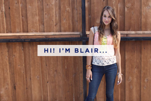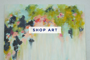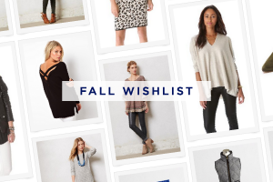


{ click on an image to view the site }
A lot of my work has been for fashion bloggers who are looking for a clean, crisp and mostly black and white design. And the font Didot is usually somewhere in the mix. While there’s nothing wrong with this, they start looking very similar and I worry that my creativity will get boxed in by recreating a similar look each time. Although, it has been testing me to add special touches to make each one stand out! I always appreciate the girl’s blog design that surprises you with by displaying her design aesthetic and personality.
I remember redesigning my portfolio site just a few months back and was having trouble deciding between two designs. One being very colorful and much more me, and the other one was black and white, modern and super crisp. I loved both, but was leaning towards the black one because I thought my clients would relate to it better. I showed them to my boyfriend, who immediately pointed out the colorful one and said it looks more like you. It was a pretty simple realization, but I decided that I need to show who I am as a designer, not who I want people to think I am.
Needless to say, I went with the colorful one.
Since I’ve been doing lots of simple blogs this month, I’ve been praying for a client who wants something a bit more whimsical. Colors, textures, pattern, typefaces… something that let’s me really stretch my creative little wings.
As of late, I’ve been attracted to this style of design (above). I love the hand-drawn elements, texture, watercolor-esque elements, the use of interesting type elements, patterns and of course colors. I’ve also recently become a bit obsessed with hand-lettering (my blog header is hand-lettered).
What design trends are you loving right now? For me, it’s whimsy!